Hi everyone, MongoMike here! It’s been too long since I’ve had a chance to blog, so I made some time to write about one of the cool MongoDB tools that I’ve had a chance to check out recently. Today, I wanted to write about getting started with MongoDB Charts in MongoDB Atlas on Microsoft Azure’s Cloud Platform, but really the instructions here will work exactly the same in AWS and Google Cloud since Charts and Atlas are cloud agnostic.
First, let me tell you a little about MongoDB Charts. MongoDB Charts is a visualization tool that lets you visualize your MongoDB data. While most existing BI Tools can access MongoDB through it’s BI Connector, MongoDB Charts harnesses the power of the document model and allows you to utilize MongoDB’s Aggregation Framework to provide some great visualizations of your data without having to conform to the relational model or otherwise flatten your data.
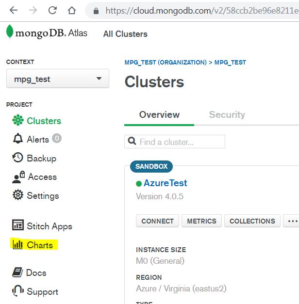
Now that we know what Charts can do, let’s get started. First we login to our MongoDB Atlas account and once logged in, we click on the Charts Icon:
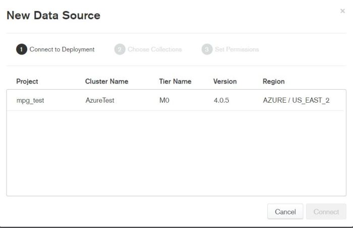
Once we click on Charts, Atlas will start installing Charts in the background, in less then a minute we’re ready to go! Now we’ll need to add a Data Source. We begin by selecting which of our MongoDB Atlas Deployments we want to pull data from.
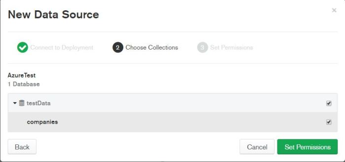
Now we’ll select which collection(s) we’ll be pulling data from! In my example, I’m using data I’ve pulled from the startup companies data set found on github. This is one of many great places to find test data for MongoDB.
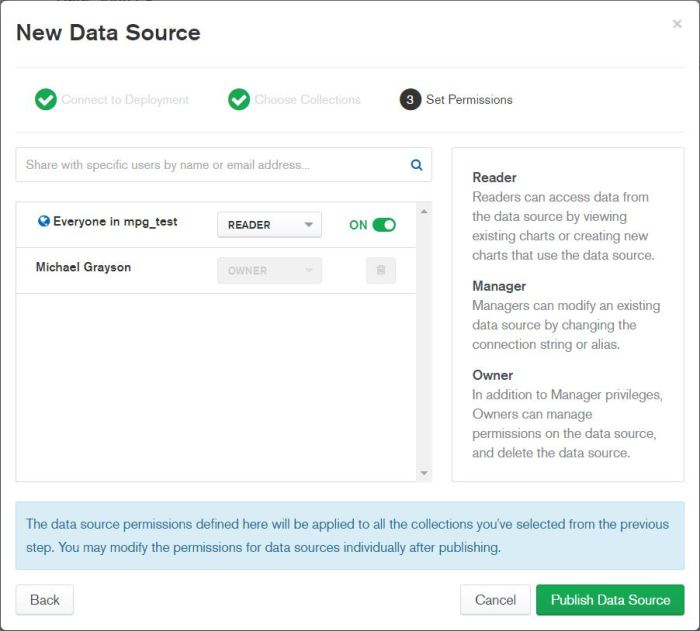
Next, we’ll set our permissions to determine what users are able to read, manage and modify the dashboards we’ll be creating with our data.
Now we can publish our Data Source and start creating dashboards! Click on the Dashboards Button in the Top Left and then click on New Dashboard to get started. The first thing you will do is name your dashboard.
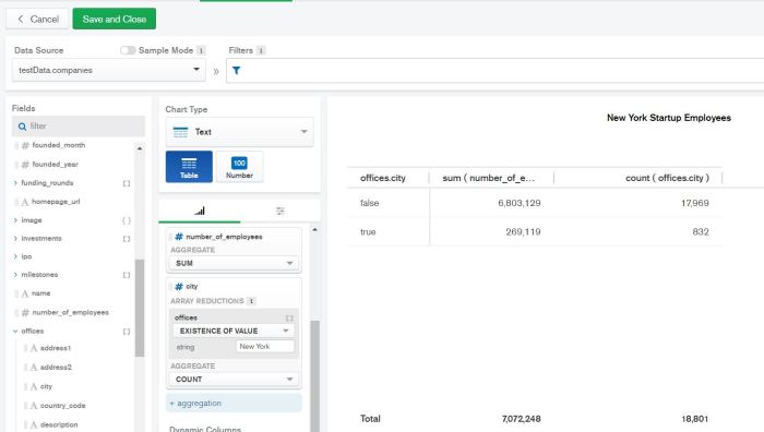
Next we’ll want to pick some interesting data for our visualizations. How about finding out which cities are more popular for startups?
For my dashboard, I’ve changed the Chart Type to “Text” and picked the “Table” sub-category. In the groups section I’ve dragged the offices.city field, and in the values section I’ve dragged the milestones.number_of_employees field and the offices.city field. This will show be how many startup employees there are in a city and how many offices as well. Here’s what my visualization looks like when I use New York as my example:
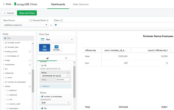
Now I’ll change the city to my hometown of Rochester and see how the numbers change. Not surprisingly, there’s a bit of a drop:
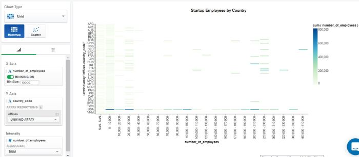
Let’s look at the data with a different type of chart. For this dashboard we’ll use a Grid Chart Type with a Heat Map to show which countries have a greater concentration of employees working for larger or smaller start ups. For the X axis, we’ll look at number of employees and bin them by 10,000, for the Y axis, we’ll look at Country Code and we’ll use number of employees for the intensity as well to show the concentrations.
With real data we could save this dashboard and it would get updated as our data gets populated, giving us real time visualizations on our MongoDB data.
With that, I hope this blog post helps show you how easy it is to get started with MongoDB Charts in MongoDB Atlas and to start making some awesome dashboards that help you properly visualize your MongoDB data. Thanks for reading!
–MongoMike
